
How SaaS Comparison Pages Win High-Intent Traffic
SaaS comparison pages capture high-intent traffic by matching commercial searches with clear comparisons, proof, and conversion paths.


High-intent traffic is not just traffic that lands on a site. It is traffic from people actively narrowing options, comparing vendors, and looking for enough proof to move forward.
That is why SaaS comparison pages matter so much.
When someone searches for terms like “Product A vs Product B,” “best alternatives to X,” or “top tools for Y use case,” they are rarely browsing out of casual interest. They are evaluating. In many cases, they are close to a shortlist, a demo request, or a purchase conversation. For SaaS companies, that makes comparison pages one of the most practical assets in a bottom-funnel search strategy.
Why SaaS comparison pages match commercial-intent searches
Comparison pages sit close to the point of decision. Search behavior data and buyer research both point in the same direction: people use comparison content when they are researching before purchase.
Semrush describes commercial-intent searches as searches made by people researching before a purchase. Ahrefs identifies “brand vs brand” patterns as a clear expression of comparative commercial intent. That framing matters because it changes how content should be prioritized. If a keyword reflects active vendor evaluation, the page targeting it should help the buyer compare, not read a generic educational article.
Buyer research reinforces that point. Gartner Digital Markets has reported that 66% of software buyers say reviews significantly affect their purchase decision, and 85% trust online reviews as much as a personal recommendation. Gartner also describes a segment of B2B buyers as “comparison shoppers,” people who want concrete evidence like features, pricing, testimonials, and ease of use.
That is exactly the territory a strong SaaS comparison page is built to serve.
How SaaS comparison pages support software buyer behavior
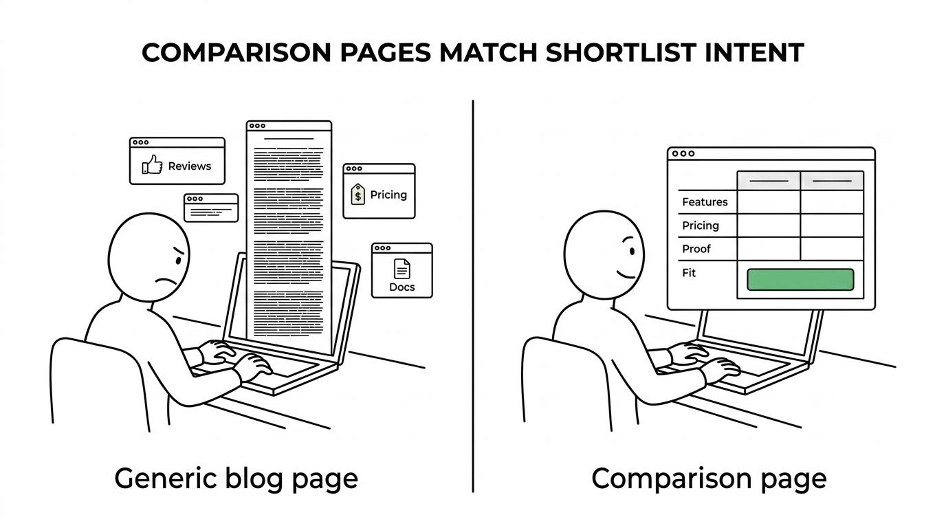
A comparison page works because it mirrors the way software decisions are actually made. Most B2B buyers do not move from first touch to purchase in one step. They create a list, narrow the list, check review sites, scan category pages, ask peers, and compare vendors side by side.
A well-built comparison page gives that buyer a faster path. It organizes the decision criteria in one place and reduces friction. Instead of forcing a visitor to hunt through product pages, documentation, third-party reviews, and pricing FAQs, the page brings the comparison into a format that feels easy to act on.
That shift is small on the surface, but commercially it is powerful.
[markdown] | Query pattern | Likely buyer stage | What the visitor wants | Best page angle | | --- | --- | --- | --- | | Brand A vs Brand B | Active evaluation | Direct comparison and tradeoffs | Head-to-head comparison page | | Brand alternatives | Shortlisting | Options, pros and cons, category fit | Alternatives page | | Best software for use case | Problem-solution matching | Which product fits a specific workflow | Use-case comparison page | | Product pricing comparison | Budget validation | Cost context and packaging differences | Pricing comparison content | | Tool integration comparison | Technical validation | Compatibility and implementation fit | Integration-focused comparison page | [/markdown]This is one reason comparison pages tend to outperform broad blog content on buyer quality. They answer a question that appears much later in the buying process.
Why bottom-funnel SaaS content often outperforms broad blog traffic
A lot of SaaS content programs still begin with awareness posts because they feel safer to publish at scale. The issue is not that top-funnel content is bad. The issue is sequencing.
If a site has dozens of blog posts but no strong comparison pages, solution pages, pricing pages, or use-case pages, it may attract visits without capturing the moments that matter most. High-intent pages are where demand converts into pipeline.
That is why many SaaS operators now place bottom-funnel content ahead of broader publishing. Public material on Austin Heaton’s site describes a content architecture that prioritizes solution pages, comparison content, and pricing pages before traditional blog posts. A published case example on that site states that bottom-funnel comparison content was indexed in the first week alongside the homepage. The signal is clear: comparison content is not filler. It is core revenue content.
This approach also makes sense in AI-driven discovery. Buyers increasingly use ChatGPT, Perplexity, Gemini, and AI Overviews to form vendor shortlists. Comparison-style content is easier for those systems to cite because it tends to contain direct claims, structured differences, feature summaries, and decision-oriented language.
What strong SaaS comparison pages include
A comparison page should not read like a product brochure with a few competitor mentions sprinkled in. It should feel useful, direct, and confident.
The strongest pages usually include a few common elements:
- Clear framing: who each product is best for and why the comparison matters
- Feature-level analysis: not just a feature checklist, but what those features mean in practice
- Pricing context: enough detail to reduce uncertainty, even when exact public pricing is limited
- Use-case fit: which teams, workflows, or company sizes match each option
- Proof points: reviews, testimonials, implementation notes, or customer evidence
- Strong next step: demo, trial, sales conversation, or product walkthrough
What buyers want is not false neutrality. They want clarity. A brand-created comparison page can absolutely advocate for its own product, but it should do so by being specific, fair, and useful.
How to write SaaS comparison pages without sounding defensive
Many comparison pages fail because they are too obviously self-serving. They overstate strengths, avoid tradeoffs, and make the reader work too hard to identify real differences.
A better approach is to acknowledge where each option fits. Buyers are not put off by honest tradeoffs. They are put off by vague claims. If one platform is better for enterprise governance and another is better for speed of setup, say that clearly. If one tool suits technical teams and another suits non-technical operators, spell that out.
That style builds trust because it respects the buyer’s intelligence.
It also helps search performance. Pages that directly answer the query tend to satisfy both users and search systems more effectively than pages that dodge the comparison. Search engines and AI answer engines are both trying to retrieve the clearest answer to the question asked.
How to choose SaaS comparison keywords with intent in mind
Keyword selection for comparison pages should begin with intent, not volume.
Ahrefs has written that keyword intent acts as a filter during research, helping teams decide whether a term belongs in the strategy at all. That is a useful standard for SaaS. A comparison keyword is only valuable if the company can serve the searcher well and convert that visit into meaningful pipeline.
A practical comparison keyword set often includes patterns like these:
- brand vs brand
- alternatives to competitor
- best tools for a use case
- competitor reviews
- pricing comparison
- integration comparison
The strongest opportunities tend to sit at the intersection of three signals:
- Commercial intent: the query suggests active evaluation, not general curiosity
- Category fit: the searcher is likely shopping in your actual market, not a neighboring one
- Conversion path: the page can naturally lead to a demo, trial, or qualified sales step
This filtering keeps teams from publishing comparison content that attracts clicks from the wrong audience.
How to structure SaaS comparison pages for ranking and conversion
Structure matters because comparison pages have to do two jobs at once: rank for intent-rich searches and move buyers toward action.
The page should open with a simple answer. Who is each tool for? What is the major difference? Which buyer should keep reading? That first screen matters because many searchers want immediate orientation before they commit to a full read.
After that, the body of the page should move from summary to evidence. A good order often looks like this:
- Quick verdict by buyer type
- Feature comparison table
- Pricing and packaging context
- Ease of implementation and integrations
- Reviews, proof, and use-case fit
- CTA to trial, demo, or talk to sales
This structure also works well for AI visibility. Systems that generate answers tend to rely on well-organized content with clear entities, direct comparisons, and explicit statements. Pages that hide key information under vague copy are less likely to be quoted or summarized well.
The role of tables, schema, and page design on SaaS comparison pages
Comparison content becomes more useful when it is scannable. That is one reason tables work so well. They help buyers parse distinctions quickly, and they make the page easier for search systems to interpret.
A table should not replace analysis, though. It should support it.
Here is a simple example of the kinds of categories that help readers decide faster:
[markdown] | Comparison area | What to clarify | | --- | --- | | Ideal customer | Team size, industry, maturity, technical depth | | Core strengths | Main value the product delivers best | | Limitations | Real tradeoffs, not hidden weaknesses | | Pricing model | Seat-based, usage-based, custom, or tiered | | Integrations | Native support, API quality, implementation effort | | Time to value | Setup speed, onboarding effort, training needs | [/markdown]Beyond visible layout, technical structure helps too. Clean heading hierarchy, comparison-focused title tags, internal links from solution and pricing pages, and relevant schema all support better indexing and retrieval. For SaaS teams investing in AI search visibility, this is especially useful because structured, decision-ready content is easier for models to interpret and cite.
Common mistakes that weaken SaaS comparison pages
Many underperforming pages are not failing because the topic is wrong. They are failing because the execution is thin.
A few issues show up repeatedly:
- Too promotional: every section reads like ad copy instead of decision support
- Too vague: claims are broad, with no evidence or real differentiation
- Too shallow: no pricing context, no implementation detail, no use-case clarity
- Too hidden: important comparison pages are buried in the site architecture
- Too isolated: no internal links from solution pages, navigation, or product hubs
One more mistake deserves attention. Some companies publish comparison pages only for the biggest competitors in the category. That can work, but it often misses easier wins. Mid-market competitor comparisons, integration comparisons, and use-case-specific alternatives pages can attract highly qualified visitors with less competition.
Where SaaS comparison pages fit in a modern content system
Comparison pages are strongest when they are not treated as one-off assets. They work best as part of a connected content system.
A practical architecture often links comparison pages to solution pages, industry pages, use-case pages, pricing pages, case studies, and product-led conversion points. That creates a path for buyers who are entering from different angles. One visitor may start with an “alternatives” query. Another may start with a use-case page and later move into a competitor comparison. The content should support both paths.
For SaaS brands focused on pipeline, this creates a better publishing priority than starting with generic blog topics. Public material from Austin Heaton’s site describes this as a bottom-funnel-first hierarchy, where comparison content sits close to pricing and solution pages rather than below them. That logic is hard to ignore because it matches how buyers actually evaluate software.
The practical move is simple: build the pages that help serious buyers choose.
If a search query signals shortlist behavior, your content should meet that moment with clarity, proof, and a direct next step. That is how comparison pages earn rankings, citations, demos, and revenue from the same piece of content.


